Great design is no longer a “nice-to-have” it’s a growth driver. In fact, 76% of users say intuitive navigation is the most important factor in a digital experience. Yet many startups still fall into avoidable design traps that frustrate users, slow growth, and ultimately force costly redesigns.
At UXDLAB, we’ve worked with dozens of startups and seen the same pitfalls repeated. The good news? With the right strategies, you can avoid these mistakes and create experiences that win trust, boost retention, and accelerate conversions.
Here are the 10 most common UI/UX mistakes startups make and how you can fix them before they hurt your product.
1. Skipping User Research
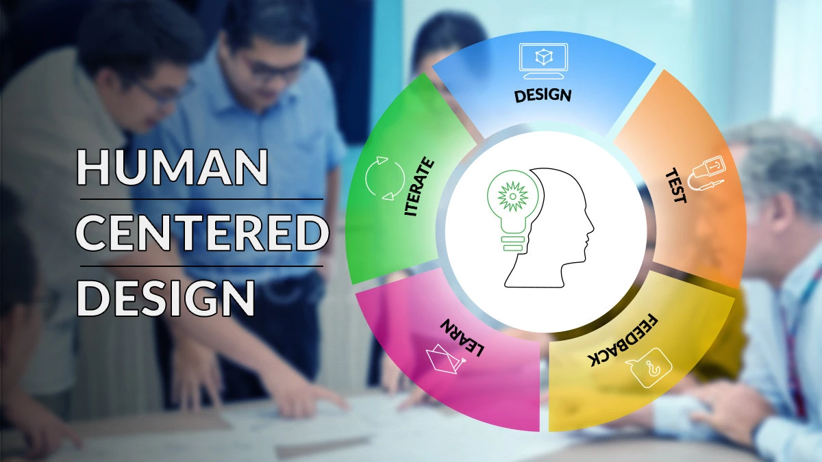
Jumping straight into development without understanding your audience is the fastest way to build the wrong product. Even global tech giants have failed because they designed based on assumptions instead of user needs.
How to fix it:
- Run lean user interviews with 5–10 potential customers.
- Use quick pulse surveys with tools like Google Forms or Typeform.
- Test early prototypes to spot usability issues before launch.
Organize insights in a shared hub, focus on 2–3 key questions at a time, and involve multiple teams to ensure findings translate into real improvements.
2. Overcomplicating the Interface
A cluttered product overwhelms users. Google Plus and Color are classic examples of startups that failed partly because of confusing design.
How to fix it:
- Create user person as to prioritize features that matter most.
- Use progressive disclosure to reveal advanced options only when needed.
- Simplify with consistent navigation, effective whitespace, and a limited color/typography palette.
Track simplicity with metrics like task completion times, user error frequency, and satisfaction scores.
3. Ignoring Mobile Compatibility
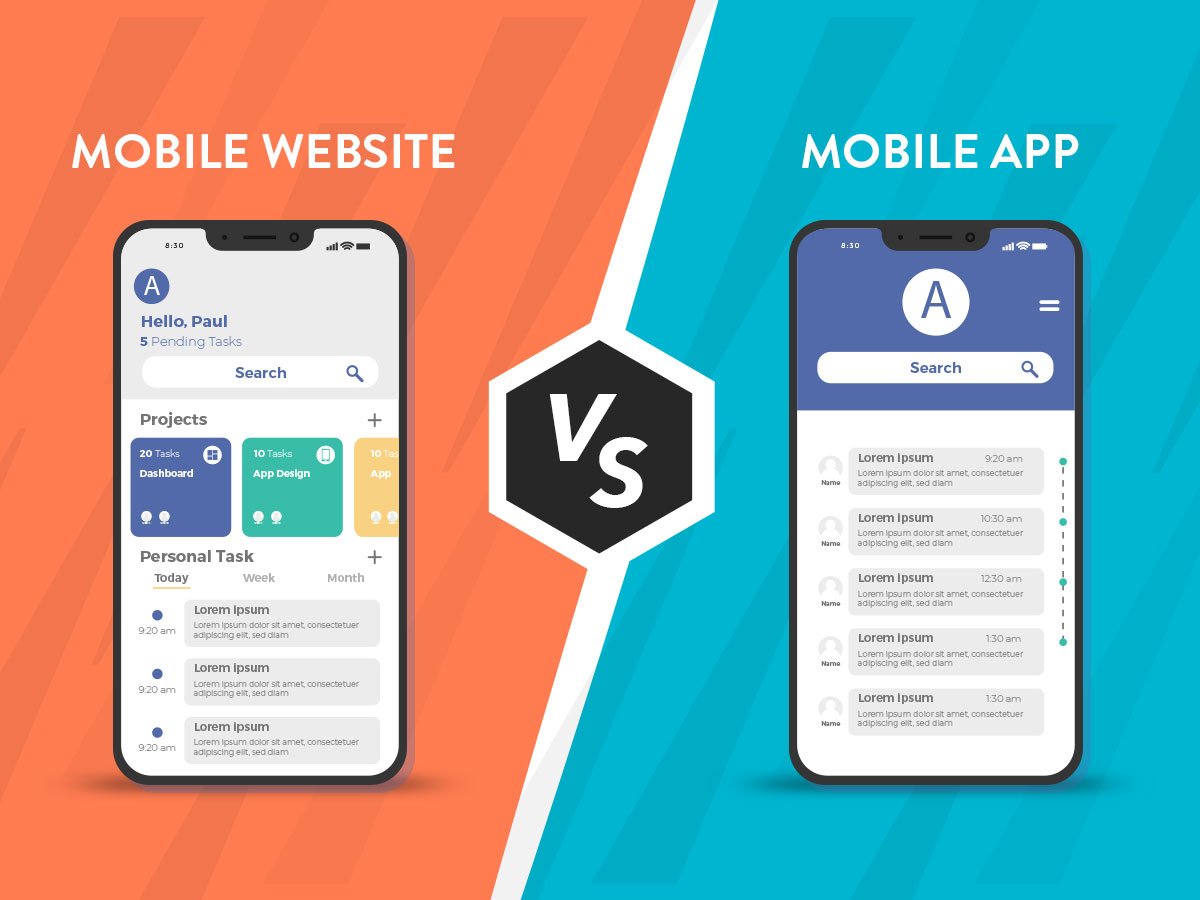
More than half of users abandon brands after a poor mobile experience. Responsive design alone isn’t enough anymore you need mobile-first design that considers intent and behavior.
How to fix it:
- Optimize performance with WebP images and lightweight code.
- Design thumb-friendly layouts for natural interaction.
- Build mobile-first, then scale up for larger screens.
Companies that improved their mobile UX have seen conversions rise by up to 62%.
4. Inconsistent Design
When your UI looks and feels different across pages or platforms, users lose trust. Google’s research found that inconsistent designs score 34% lower in perceived credibility.
How to fix it:
- Build a design system with typography, color hierarchies, reusable components, and spacing rules.
- Conduct weekly design audits to ensure new features stay consistent.
- Treat your design system as a living guide evolving with your product, not limiting it.
5. Overlooking Accessibility
Accessibility isn’t optional. With 1 billion+ people worldwide living with disabilities, ignoring inclusive design excludes a huge audience and poses legal risks.
How to fix it:
- Use semantic HTML and ARIA labels for screen readers.
- Support full keyboard navigation.
- Ensure high color contrast and add descriptive alt text to images.
Accessibility doesn’t just help disabled users it makes the experience better for everyone.
6. Poor Navigation Design
If users can’t find what they need, they won’t stay. Complex or inconsistent navigation increases frustration and abandonment.
How to fix it:
- Keep menus simple and logical.
- Use bottom navigation bars and familiar swipe gestures on mobile.
- Validate with user behavior data and adjust navigation flows accordingly.
Southwest Airlines improved customer satisfaction by rethinking their app navigation proof that simplifying pathways boosts usability.
7. Neglecting Performance
A 1-second delay can reduce conversions by 7%, and 53% of mobile users leave slow sites.
How to fix it:
- Compress images and enable caching.
- Reduce heavy JavaScript.
- Use tools like PageSpeed Insights, WebPageTest, and New Relic to monitor.
Case in point: Pinterest boosted engagement and retention after cutting load times by 40%.
8. Weak User Onboarding
If onboarding is confusing, users leave before they see your product’s value. A strong onboarding experience makes users 3x more likely to stick around.
How to fix it:
- Highlight quick wins instead of long feature tours.
- Use guided walkthroughs, tooltips, and sandbox environments for safe exploration.
- Track onboarding completion rates and time-to-value to refine the flow.
Keep it mobile-friendly with short forms, progressive disclosure, and large tap targets.
9. Unclear Call-to-Actions (CTAs)
A weak or confusing CTA kills conversions. Users need clear direction to take the next step.
How to fix it:
- Make CTAs visible, bold, and action-oriented.
- Use Sample spacing, high contrast, and mobile-friendly sizes (44 x 44 px).
- Place CTAs where users naturally expect them guided by their journey.
Test click-through and conversion rates to continually optimize.
10. Ignoring User Feedback
Failing to listen to users means missing opportunities to improve. Companies that act on feedback see retention improve by 2.4x.
How to fix it:
- Collect input through in-app surveys, usability tests, support tickets, and analytics.
- Categorize feedback into critical fixes, enhancements, and future ideas.
- Set clear timelines and goals for implementing changes.
The Ride app grew rapidly by turning continuous user feedback into product updates.
Final Thoughts
Startups don’t fail because of lack of ideas they fail because they ignore users. By avoiding these 10 major design mistakes, you can save time, reduce churn, and build products people actually love.
Quick wins to remember:
1. Research your users early and often
2. Simplify interfaces and navigation
3. Prioritize mobile-first performance
4. Make accessibility part of your DNA
5. Gather and act on user feedback
At UXDLAB, we’ve seen startups achieve 2–5x higher conversion rates just by making thoughtful UX changes. If you focus on clarity, inclusivity, and performance, your product won’t just look good it will grow.


