Securing funding is one of the most crucial milestones in a startup’s journey. Investors want to see more than just a groundbreaking idea; they want proof that the product has the potential to succeed in the market. While startups often focus heavily on features, technology, and financial projections, one aspect that often gets overlooked is user experience (UX). In today’s highly competitive environment, a seamless and intuitive user experience can be the differentiator that convinces investors to believe in a vision.
This is exactly what happened when our team partnered with a young startup struggling to secure funding. Despite having a promising concept and a passionate team, they faced repeated rejections from investors. Their product was innovative, but the execution fell short in terms of usability, design clarity, and overall engagement. In this case study, we’ll take you behind the scenes and explain how improving their UX not only transformed their product but also helped them secure the funding they needed to scale.
The Startup’s Initial Challenges
When the startup first approached us, they had a working prototype of their platform but were facing multiple roadblocks. The concept was solid, addressing a genuine pain point in their industry. However, early testers and potential investors pointed out consistent issues. Users found the interface cluttered, navigation confusing, and key features buried under unnecessary steps.

The product also lacked visual polish. Investors, who often evaluate startups within minutes of a demo, were not convinced of its market readiness. The design failed to communicate the startup’s value proposition clearly, making it difficult for them to pitch confidently. As one of the founders admitted, “We knew our idea was good, but every time we tried to showcase it, people just didn’t get it.”
It became clear that while the startup had strong potential, the poor user experience was creating doubt about the product’s viability. That’s when our team stepped in to redesign the UX from the ground up.
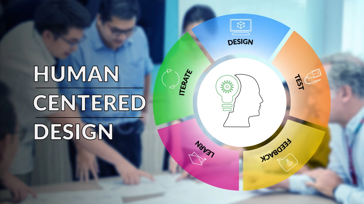
Step 1: Understanding the Users and Investors
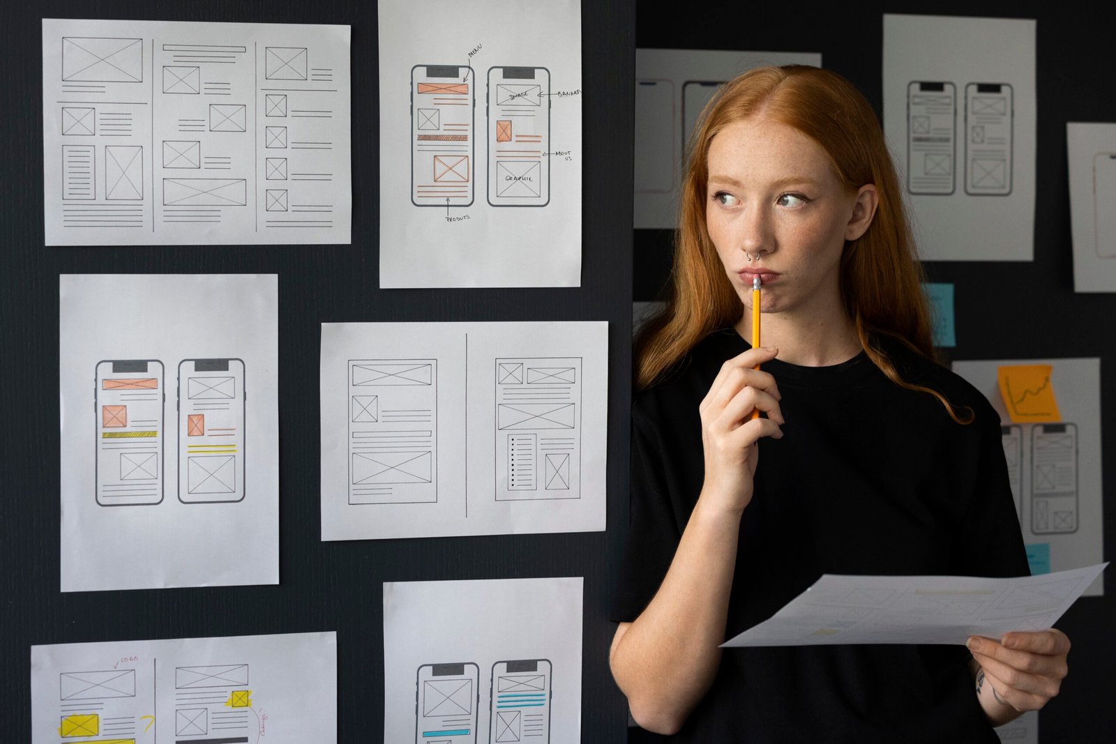
The first step in our process was deep research. We needed to understand both end-users and investors, because both groups were critical to the startup’s success. For users, we conducted surveys and interviews to identify their biggest frustrations with the current prototype. We mapped out user journeys to pinpoint where people were dropping off or getting stuck.
For investors, the focus was slightly different. We analyzed pitch feedback and held conversations with mentors to understand what investors wanted to see. It became clear that they weren’t just looking for a functional product; they wanted to see evidence of scalability, adoption potential, and a polished interface that could compete in the market. By aligning these insights, we set a clear goal, redesign the product in a way that delighted users and gave investors confidence in its future.
Step 2: Simplifying the User Journey
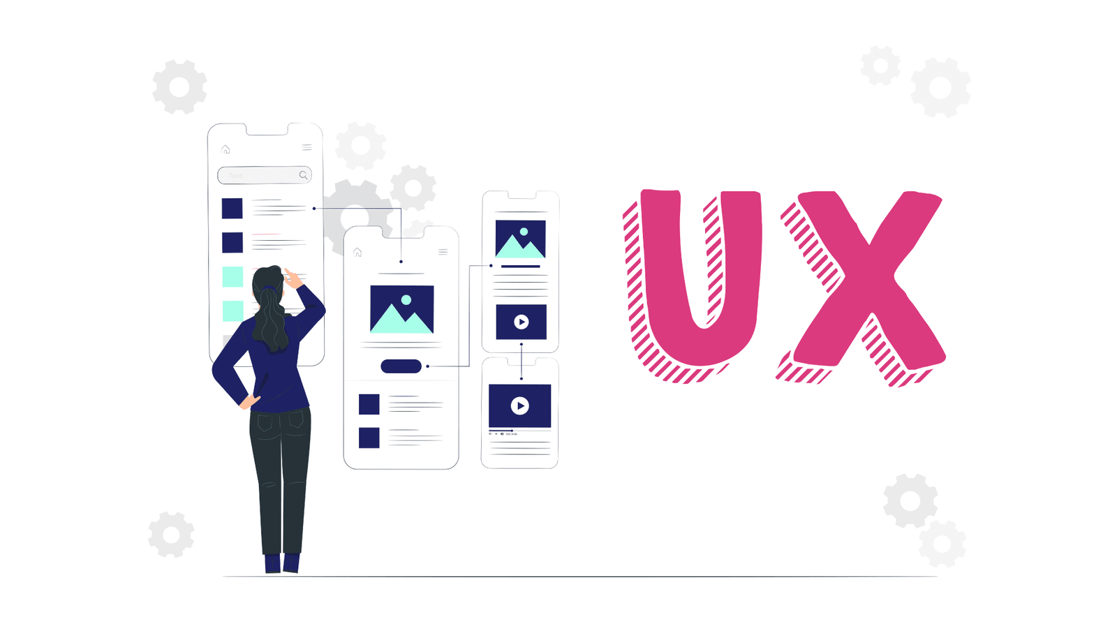
The original prototype had too many steps for simple actions. For example, signing up and completing a basic task required multiple clicks, leading to frustration. Our team streamlined the user journey by removing unnecessary steps, reorganizing the navigation, and ensuring that the most critical features were front and center.
We focused on clarity and simplicity. Every screen was designed with a single purpose, guiding users toward completing tasks effortlessly. By applying principles of cognitive load reduction, we ensured that users never felt overwhelmed. This not only improved usability but also made demos flow more smoothly for the founders when presenting to investors.
Step 3: Enhancing Visual Design and Branding
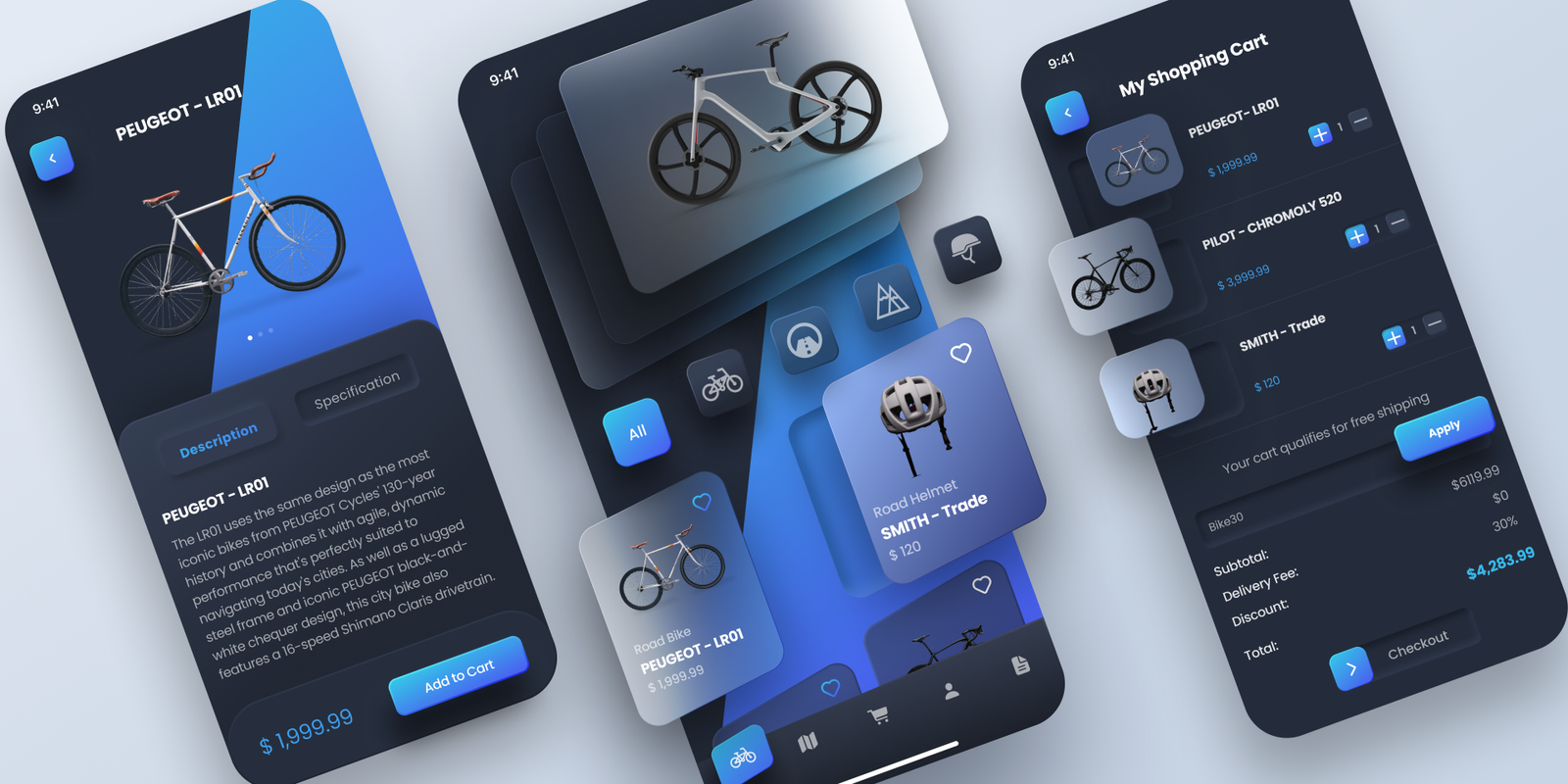
First impressions matter, especially when trying to secure funding. The old design lacked consistency and failed to communicate professionalism. Our design team introduced a modern, clean, and visually appealing interface that reflected the brand’s identity and vision.
Colors, typography, and layouts were carefully chosen to create a sense of trust and innovation. We also introduced micro-interactions small animations and feedback cues that made the product feel polished and responsive. These changes gave the platform a professional edge, making it look investor-ready while still staying user-friendly.
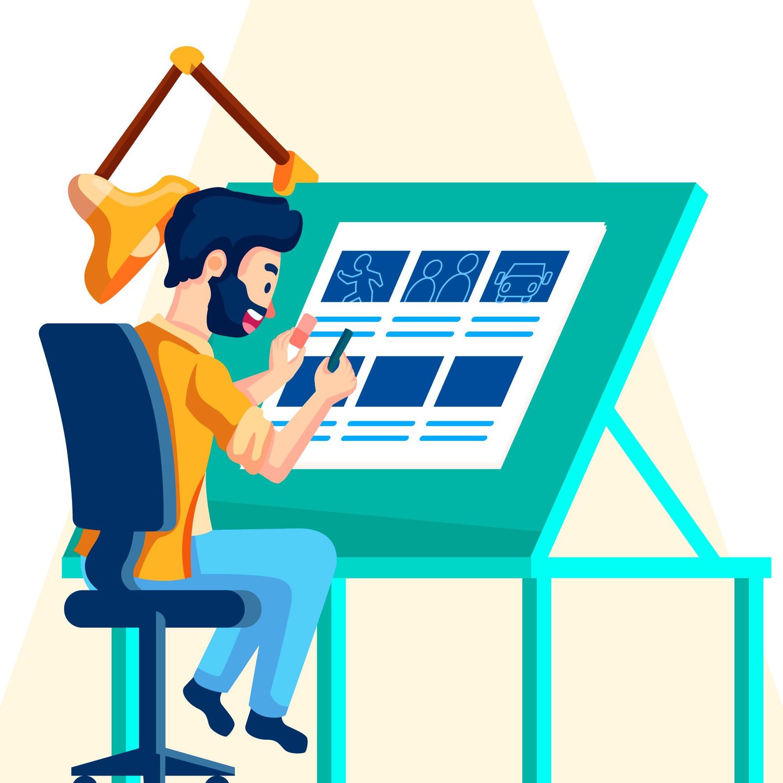
Step 4: Building a High-Fidelity Prototype
Instead of asking investors to imagine how the product might look in the future, we provided the startup with a fully interactive prototype. This prototype looked and felt like a finished product, even though it hadn’t been fully developed yet. This gave the founders a powerful tool for pitching, as they could let investors experience the product firsthand rather than relying on slides or explanations.
The prototype also allowed us to run usability testing with real users. The feedback was overwhelmingly positive, with testers noting how much easier it was to navigate and how the product’s value was now clear within minutes. This validation gave both the team and investors confidence in the product’s potential.
Step 5: Aligning UX with the Pitch
UX is not just about the product it’s also about the story you tell. We worked with the startup to ensure that the redesigned product aligned with their pitch narrative. Instead of focusing solely on features, we highlighted the user benefits, showcasing how the platform solved real-world problems efficiently.
By demonstrating smooth workflows and a delightful interface during investor meetings, the founders were able to shift the conversation from “Can this work?” to “How fast can you scale this?” The improved UX became a central part of their storytelling, making their pitches far more compelling.
The Results: Funding Secured
Within three months of the redesign, the startup successfully secured seed funding from a group of angel investors. What changed wasn’t the core idea it was the way the idea was presented and experienced through better UX.
Investors were impressed by the product’s usability and professional design, which showed that the team could execute their vision at scale. Users were more engaged, with early adopters providing positive feedback and demonstrating strong retention rates. Together, these factors created the perfect momentum for funding.
The founders later shared that the redesigned UX gave them the confidence they needed to pitch boldly. Instead of worrying about how investors would perceive the product, they focused on discussing growth strategies and future plans.
Lessons for Other Startups
This case study highlights an important truth: great UX is not just about pleasing users it’s about building investor confidence. A confusing interface or clunky design can make even the best ideas look unprepared for the market. On the other hand, a seamless, polished product can inspire trust and excitement.
For startups seeking funding, investing in UX early is one of the smartest decisions you can make. It signals to investors that you care about your customers, understand their needs, and have the ability to execute effectively. It also helps differentiate your product in a crowded marketplace where every detail matters.
In the journey of this startup, the turning point wasn’t a new feature or a pivot in strategy it was a commitment to better UX. By redesigning the product with users and investors in mind, they were able to showcase their vision in a way that resonated with both groups. The result was funding that allowed them to scale, innovate, and move closer to their mission.
At its core, UX is about creating value for users, businesses, and stakeholders alike. This story is proof that when startups prioritize user experience, they don’t just create better products they create stronger businesses.


