In the fast-paced digital era, your website is often the first impression a potential customer has of your brand. Whether you run a startup, an e-commerce store, or a B2B company, the way your website looks and functions can directly impact sales, trust, and customer loyalty. Yet, many businesses continue to struggle with outdated designs, slow loading speeds, and confusing navigation, which eventually hurts conversions. A strategic redesign, when done correctly, can transform a struggling website into a high-performing asset that drives measurable growth. In this article, we will explore the “before and after” journey of a website redesign that doubled conversions, analyzing what went wrong initially, how the problems were solved, and what lessons businesses can take away from this transformation.
Why Website Redesigns Matter

A website redesign is not just about changing colors, adding new visuals, or updating fonts. It is about aligning your digital presence with your audience’s expectations, modern usability standards, and business goals. Many companies invest heavily in marketing campaigns but fail to realize that if the website is poorly designed, all that effort goes to waste. Imagine paying for ads that drive thousands of visitors to your site, only for those visitors to leave within seconds because the website looks outdated or loads too slowly.
Before a redesign, most websites share common pain points such as cluttered layouts, unclear calls-to-action (CTAs), unresponsive design for mobile users, and content that doesn’t connect with the target audience. On the other hand, a successful redesign focuses on creating a seamless user experience, establishing trust through professional design, and optimizing conversion funnels that guide visitors toward taking action whether that’s signing up for a newsletter, requesting a demo, or making a purchase.
The “Before” Scenario: Challenges That Held Conversions Back
Let’s start with the problems many businesses face before redesigning their website. These issues not only make the site look unappealing but also actively discourage users from converting.
One of the most common issues is poor visual hierarchy. If a visitor lands on a page and can’t immediately figure out what the business offers, they will leave within seconds. In the case of our example, the website’s homepage was overloaded with text blocks, mismatched colors, and too many CTAs fighting for attention. Instead of guiding visitors, it confused them.
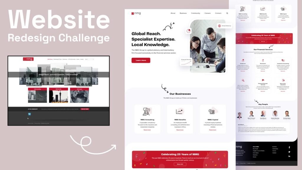
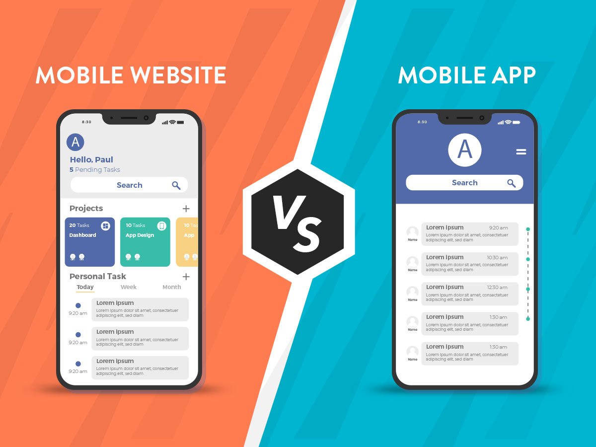
Another problem was mobile responsiveness. Over 60% of web traffic today comes from smartphones, yet the older design wasn’t optimized for mobile. Buttons were too small to click, images didn’t scale properly, and text often overlapped. As a result, bounce rates were extremely high for mobile visitors, costing the business a significant share of potential leads.
Speed was another conversion killer. The site took nearly 6–8 seconds to load on average, which is far longer than what modern users expect. According to research, even a one-second delay in load time can reduce conversions by up to 7%. The heavy, unoptimized images and outdated codebase made the website sluggish, turning away impatient users before they even had the chance to engage.
Finally, the lack of trust signals created doubt in the minds of visitors. The old website lacked customer testimonials, case studies, security badges, or any strong value proposition. With so many competitors offering similar products and services, failing to build credibility meant losing customers to businesses with stronger digital presence.
The Redesign Process: Building for Growth and Conversions
When it was time to redesign the website, the approach was not limited to surface-level improvements. Instead, the redesign was guided by data, user behavior insights, and conversion-focused strategies.
The first step was simplifying the overall design. The new homepage was built with a clear hero section that immediately communicated the brand’s core offering in a concise and visually appealing way. A single, prominent CTA was placed above the fold, reducing distractions and encouraging users to take the next step. By creating a logical flow of information, visitors were guided through the site effortlessly.
Mobile-first design principles were applied to ensure the website looked and functioned seamlessly on all devices. Instead of cramming content into smaller screens, layouts were restructured, menus were optimized for touch navigation, and forms were simplified for mobile users. This dramatically improved user experience for more than half the site’s audience.
Speed optimization became a top priority. Heavy images were compressed, code was cleaned up, and modern frameworks were implemented to enhance performance. With these updates, the website’s load time dropped to under 2 seconds, significantly improving engagement rates.
Content also received a major overhaul. Instead of long, jargon-heavy paragraphs, the new site used concise messaging, clear benefits, and storytelling elements to connect with the audience. Social proof was strategically placed across the website in the form of testimonials, client logos, and case studies. This added credibility and reassured potential customers that they were making the right choice.
Finally, analytics and tracking tools were integrated into the new website to continuously monitor user behavior. This allowed the team to measure performance, run A/B tests, and make ongoing improvements rather than treating the redesign as a one-time project.
The “After” Results: Doubling Conversions
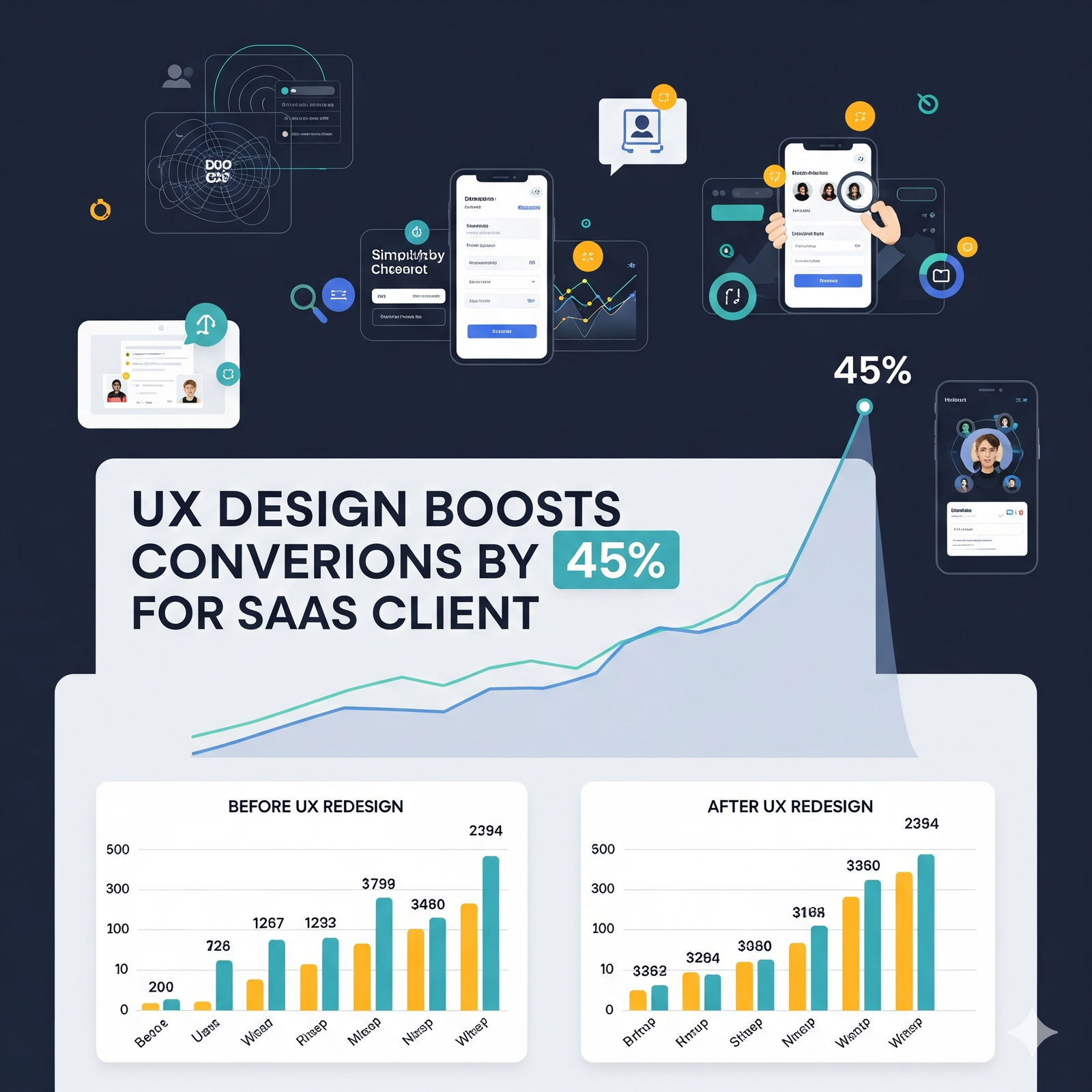
The transformation was remarkable. Within three months of launching the redesigned website, conversion rates had doubled compared to the old version.
The new homepage’s simplified layout and strong CTA placement resulted in a 40% increase in lead form submissions. Mobile conversions, which were almost non-existent before, grew by over 70% as the redesigned site delivered a seamless experience across devices. The faster load times drastically reduced bounce rates, keeping users engaged long enough to explore the brand’s offerings.
Trust signals such as testimonials and case studies played a critical role in convincing users to take action. Visitors no longer felt skeptical about the brand’s credibility, leading to a noticeable increase in both demo requests and purchases. In addition, the implementation of data-driven tracking allowed the company to fine-tune its content and CTA placements continuously, ensuring that conversions remained on an upward trajectory.
Lessons for Businesses Considering a Redesign
The success of this redesign highlights a few critical lessons for any business considering a website overhaul. First, always design with your users in mind. A website should not be built to please internal stakeholders but to provide value and clarity for customers. Second, focus on functionality before aesthetics. A beautiful site is meaningless if it loads slowly or confuses users. Third, trust is non-negotiable. Incorporating social proof and security elements can significantly influence customer decisions. Finally, think of a redesign as an ongoing process rather than a one-time fix. Digital behavior is constantly evolving, and your website should evolve with it.
A poorly designed website can silently sabotage your business, no matter how good your product or service is. On the other hand, a thoughtfully executed redesign has the power to turn your website into a high-performing sales machine. As we saw in this before-and-after journey, small but strategic changes such as improving speed, optimizing layouts, and adding trust elements can lead to massive results, including doubling conversions.
If your current website isn’t delivering the results you want, now might be the time to take a closer look at what’s holding it back. A redesign is not just about refreshing the look it’s about building a foundation for long-term growth, higher engagement, and increased conversions.









![Case Study: How We Helped [Client] Scale with a Custom Mobile App](https://uxdlab.com/wp-content/uploads/2025/08/case.png)


